i really enjoyed this project, i liked how it related to something i new about and we were aiming to please a live client. i also like how we were just aiming to please the public.
i think i really enjoyed working on a new program that i eventually understood and found easy to use.
i also liked how i got to draw my characters out and use then in my final video.
if i was to do something like this again i would perhaps try to build up more skill on the program to make it more interesting and to flow a but better.
i would like to do something like this again, and to build up more skills on after effects.
i think i have worked well on this brief as i have completed everything on time, and to the standard that i wanted to achieve.
Year 2 Work
Hello, I am a Graphic design student at Central Bedfordshire college and this is a blog of all work i have done in my second year. Enjoy :)
Thursday, 3 April 2014
video link
https://www.youtube.com/watch?v=Ylf9h3BV1yM&feature=youtu.be
this is the link to my final video, uploaded onto my youtube account.
after effect screenshots
this is the document set up. i made my length just over 30 seconds so it would it in with the song.
first i uploaded my first background
then i placed in the buildings
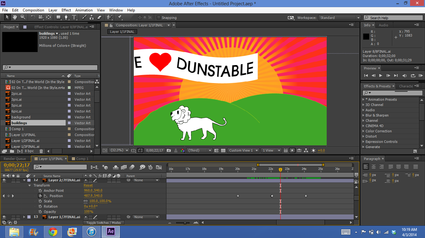
then i made the sun rise, but using the position tool
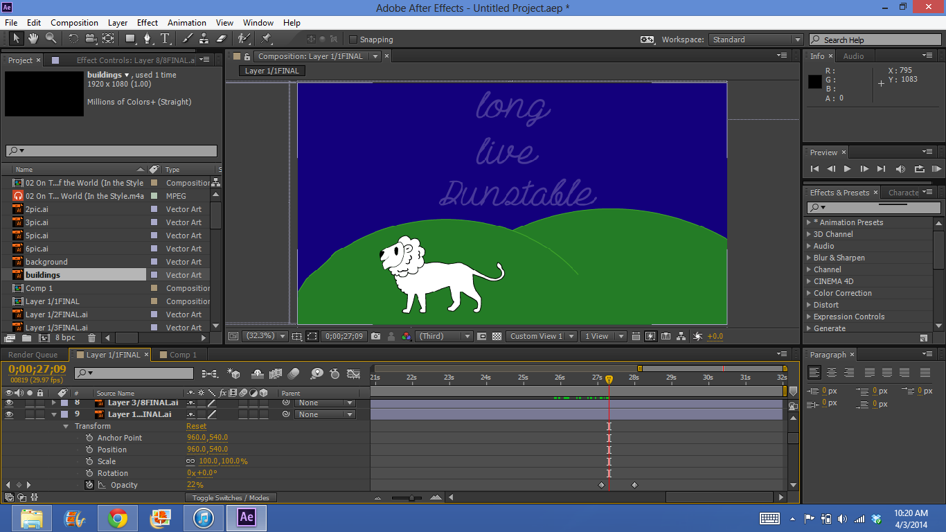
i then faded in the type by using the opacity tool.
then i slid the next scene along to cover my old scene. i did this by using the positioning tool
i then made all the shoes jump up infront of the buildings
then i slid my buildings along, ( like walking down the street)
and had the shoes pop up again,
i then slid it to my last set of buildings
and then made my elephant and bowling ball pop up
then made it look like my elephant was bowling the ball by simply sliding it using the positioning tool
then i had the next scene slide in over the buildings
i made the cloud and sun pop down
at the same time i had the park fade in
then i slide it all along to the downs
there i had all the people made in
then i made the plane come in
and the plane moved along and the man moved down
then i made it look like the plane was dragging the next scene in by its rope

where the type then fades in
and the moon and stars pop down one by one.
like this.
first i uploaded my first background
then i placed in the buildings
then i made the sun rise, but using the position tool
i then faded in the type by using the opacity tool.
then i slid the next scene along to cover my old scene. i did this by using the positioning tool
i then made all the shoes jump up infront of the buildings
then i slid my buildings along, ( like walking down the street)
and had the shoes pop up again,
i then slid it to my last set of buildings
and then made my elephant and bowling ball pop up
then made it look like my elephant was bowling the ball by simply sliding it using the positioning tool
then i had the next scene slide in over the buildings
i made the cloud and sun pop down
at the same time i had the park fade in
then i slide it all along to the downs
there i had all the people made in
then i made the plane come in
and the plane moved along and the man moved down
then i made it look like the plane was dragging the next scene in by its rope
then the planes banner slowing goes out of the shot
and here the sky begins to made into the night

where the type then fades in
and the moon and stars pop down one by one.
like this.
Wednesday, 26 March 2014
layouts
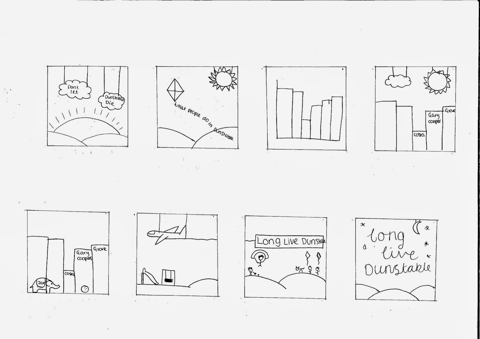
these are my layouts throughout the projects. these show how i got to my final ideas and what colours and transitions i wanted to use.
so my first idea had clouds coming down at the beginning of the video, and i also asked a question and showed a graph that then turned into buildings, and just had iconic things to do in dunstable sliding along (like in my final) but thought it needed something else.
so i decided to create the first slide as a sunrise with the clouds infront,then added some detail to my other scenes, then ended it with night time. but then i though the question didnt have much relevance and people wouldnt stop to read it.
so i went back to my breif and saw the word 'footfall' so that got me on the trail of feet, and shoes so i deiced to have the sunset without the clouds and then have feet runing through the buildings. and i also added in a sunset then night time.
i then came up with an idea of using a skyline of dunstable, like the london one. so i added this in at the begining with the sunset behind. it also made it go from buildings to a close up of buildings with feet running through.
then i added feet to my other building slide becuase i wanted each little slide to be interesting. i also added the white lion on the hill becuase it is a very icon feature to dunstable downs.
this is all the type experimentation i did.
then these are my final idea layouts with infomation on about transitions, fonts, and colours.
chosen music
https://www.youtube.com/watch?v=4_PMZUu9pww
this is the song i have chosen to use on my motion graphics.
i have chosen this becuase it is a very happy and upbeat song.
although the lyrics are not offensive, i have decided to chose the instrumental becuase they lyrics were not relevant to this breif, and could distract you from that the motion graphics is trying to say.
i want to run the song the whole way through with it starting at the beginning. although my video if not 3 mins long, so i will have to crop it to fit into my motion time.
motion graphics tutorials
we had dan come in to show us the basics of the programme motion.
he had found some online tutorials for us to follow, that would take us through the basics of working this programme.
http://www.lynda.com/Motion-tutorials/Setting-essential-preferences/82541/88146-4.html?autoplay=true
we then has callum come in to show us the programme after effects. he took us through the basics of the programme.
i prefer this program, i think it is easier to use and i can also get it on my laptop, so i will be creating my final outcome on this.
dont let dunstable die lady
we met one of the ladys behind the 'dont let dunstable die' scheme.
she came in to give us a better idea of what our motion graphics needs to include and what it will be about.
the main points i got from her was:
she came in to give us a better idea of what our motion graphics needs to include and what it will be about.
the main points i got from her was:
- make it positive, a positive outlook on dunstable.
- make it upbeat and happy for people to watch
- keep it modern, something that will catch peoples eyes
- aim it at the young children, teenagers, family, couples and also elderly people.
- dont include anything about empty shops, this could be negative
- show that there are things for people of all ages to do in dunstable
- free parking after 10pm
so the overall she wants is too keep it very positive and make duntable appealing.
Subscribe to:
Comments (Atom)


