Monday, 21 October 2013

Line drawings

These are some line drawings of a teapot, tea cup and saucer and a milk jug. I did this because after looking at Jonathan allardy and Hannah Davis I wanted to create similar type of work. I could either scan these into illustrator and add colours into it.  Or I could get a large projector and project them on to the wall and paint where the lines are, and add colours. 
I think this is a really good idea because it is very different from most cafés and it will  give the refectory a nice feel, it will change the walls from bring just red! and will give it some ambience. 

Thursday, 17 October 2013

Jonathan Allardyce


Jonathan Allardyce is an award-winning creative with 20 years of professional experience. Jonathan draws using a touch sensitive display - the Wacom Cintiq - then colours and finishes his illustrations in Adobe Photoshop. He also uses Adobe Illustrator to create sequences for animation.
I think his style of work is really nice because it is very realistic but at the same time you can tell it is drawn. All the colours he uses are very vibrant and stand out well. He also uses toning very well in a attractive way. I think something similar to this would be a nice feature for some wall art in the refectory, and will change the mood of the refectory a lot, it may give it a more happy ambiance.
I think the limes are very nice because it has a lot of tone and shading added, which gives it a different feel to as if it was was one colour.
I think the yogurt pot is nice because every strawberry had detail on it, and the colours are so bright. it is like he took a photo of it.
I like the cup of tea because it also looks like just a normal photo. it has different shades of colours when needed, it is very accurate to a real cup of tea.
I could do something similar to this but using line drawings. I could then scan my drawing in illustrator and add colour on the illustrator like Jonathan, or I could get an over head projector and project them onto the refectory wall and draw over it from that. 

Logos

I looked at Ben and Jerry's logo because i thought it was nice how they had type but also a picture behind it to make it look interesting. I also like the colours they have used because it makes it look appealing and it is an icon image to remember. For the refectory, it may he nice to have something like this, an iconic picture that people will remember, this could be printing on various of things around the refectory.
This is the Hard Rock Cafe logo. The colours it used bounce of each other to attract the eye more. The colours work well becuase it still looks so simple but there is a lot going on still. I think the typeface looks nice to because it is quite trendy and will appeal to most generations. 

I looked at Gregg's which is a chain of bakeries. I think that the orange and blue are good becuase they are complementary colours. This means both the colours complement each other and the white just breaks up the logo a little to give your eyes a rest. 
This is the logo for Taco Bell, an Mexican restaurant. The colours used are analogous colours, next to each other on the colour wheel, this helps it harmonanise with each other and makes
it easy to look at. But they also have the hello contrasting with the purple, this draws your eye into the yellow. I really like this logo becuase of the colours. However I think the type is pretty boring, but that may be good becuase there is so much colour used.
This logo is Nintendo. It is a very simple logo, but I think it is still effective becuase it is well know everywhere. I think the type is simple but it is very nice and the Kearning is evenly spaced which is nice, also the circular box is around it, it just finishes it off. The colours are very simple but I think this helps make it easier to remember and makes it more recognisable. 

Wednesday, 16 October 2013

Visiting cafés


The first cafe I went to visit was costa coffee. When I was sitting in here I noticed how there is many canvases hung up on the wall, these pictures are mostly scenes of Italy, this helps create the atmosphere because it is an Italian themed cafe, so these pictures make you feel as if you are in Italy. They use a deep red colour in their logo and they follow this theme with the furniture and packaging. This colour gives it a very warm cosy feeling, this is nice because it is selling mainly hot drinks so having this cosy feeling will relax you while you are in this shop. I like their menu because it is very large and it looks like they keep it up to date, with different offers they have. Also I like the little strip they have under the Menu with an offer on. They also include many pictures on their menus of their products. The menu looks like it is just vinyl sticker on foamex, which means it will last a while and it is easy to put up.

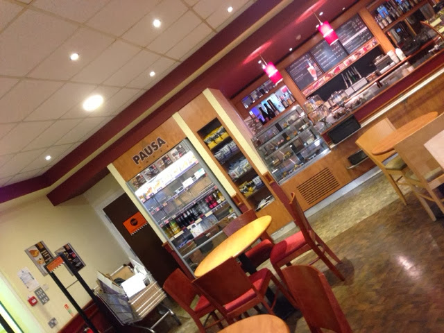
I then when to visit the pausa caffe, which is a small cafe in dunelm. This cafe had a similar theme colour to costa coffe, exept it is a little brighter, this gives it a little more of a upbeat feeling, but relaxing at the same time, as if after you have done yor shopping you can have a rest in the cafe. I like how their menus are black background with red and white type because it makes the type stand out and easy to read from further away. I like how they have a small banner on the door to advatise the cafe, something like this would be nice on the doors of the refectory. They have a vinyl sticker on the door to advertise it as you walk in. Also their menus look like they are also on foamex.

This is a subway in a garage, it looks pretty much the same as it would in its own shop. They have a large sign outside  that is lit up, so it is well seen at night. I like the menu becuase it has different kind of poster on it advatising the flavours. Also they have a step by step menu, which shows you the options you can have and in what order. This would be a nice for the refectory, to have a clear Menu and prices. 

This is asda cafe, the colours are very similar to costa and the cafe in dunelm, this shows that the colour is popular in cafés, and gives a warm friendly feeling. This cafe has a really small Menu board that you can't really see it that well, also the feeling you get in there is that it is small and uncomfortable, this may be because the furniture is very hard and the other colour is wood which doesn't look as nice as other colours.
I also visited mc Donald's which is a bigger company with restaurants all over the country. Inside there it has a very later back friendly armoshohere with music playing in the background. They have switched to a green theme, which is running throughout all their restaurant, the seating, packaging and even the building. Their menu boards at the top only show what offers they do, and what they are selling currently, there is a Perspex menu with all the food and drinks that they sell. This might be a good idea for the cafe, to have offer menus as well as a full menu. 

Colour theory

This is a handout we got given to learn more about colours.
I made my own colour wheel to ensure i understood about the colours. It went wrong on the orange colours because there was no pure orange swatch, so I had to make a pure orange swatch. 

We had to make a complementry colour pattern, I chose green and red, however these two colours together made my head hurt becuase they are such strong colours. 
This is another complemently colour pattern, however this one I used softer colours so it would be easier to look at, and it worked, the colours work well together and bounce off of each other. 
For this pattern I used analogous colours which are colours next to each other on the colour wheel. My dominant colour is green, and my support colour is light blue, for my third colour I mixed some black into the blue, this is then called an accent colour. 

Tuesday, 15 October 2013

college and uni cafe designs

Southbridge college refectory
"The college a range of delicious hot and cold snacks, sandwiches, light lunches, meals and beverages in addition to vegetarian and healthy eating options – perfect for meeting up with friends when you need a snack between classes."
This college refectory gives off a nice chill out vibe by using the 3 simple colours, but it also looks very formal and clean, which is good becuase there would be older ages and aldults in college and this formal look would appeal to them. I think something like this would be really nice for the refectory but as their is a lot of colours used already, this would mean making the logo very simple, yet effectve, and being careful not bring many more colours in, or to allow it to clash.


Bury college cafe  - The vista
This is a cafe for the college students to eat lunch and buy food, and drinks from, just like our refectory in college.
I like the logo that they have, it fits together nicely, with the capital 'V' and  'A' the 'the' its in nicely, and i think it flows well. I also like how they have used the colour purple, becuase it is quite a deep warm colour, but also its a bright enough colour to make it appeal to college students. They could of made the tabels to match their purple theme. I think using one simple colour can be effective, i will look at this when creating the logo for the refectory.
 http://www.burycollege.ac.uk/about/refectories.aspx


Macclesfield college
This cafe has a very open space when collecting food, and a well spaced out seating area. It only has a small sign above the kitchen area.
I think this design is very boring and too simple. It doesnt look like it has any atmoshphere because there is not enough colour to attract people. However i think it is a nice idea to have the menus on the tables, so people can view food at their seats, this might be a nice idea to have at the refectory in college.

interior design of cafes


Cocotte's aim if to bring people together (family and friends) because it is a communal - restaurant - bar.  Coctte has a gritty interior design.

I really like this design because it is different from other cafes and it will appeal to different people. i like their signage because it is very simple but effective because it had the lighting behind it to make it stand out from the dark wall. Also the chairs have some of the primary colours, like the refectory in college, so i can look at what colours they used with the primary colours and try to work out a theme colour.

Image:


Amici is an italian restaurant that aims to have fresh quality food and friendly service. 
I like the design of this cafe because they have used red white and green which is keeping it with the italian theme, because these are the colours used in the italian flag. This helps set the atmosphere. The tables they have used fit well with the theme, it gives it a nice natural feel, and its simple and relaxing. The relaxed feeling here is opposite to the feeling in the refectory - in the refectory it had a bright, vibrant feel, which will attract the target audience more. 
Photos 


starbucks
Our Design Goals 
Across the world our store designs are rooted in our coffee heritage, and in our Starbucks™ Shared Planet™ community involvement and environmental responsibility goals. So our designs reflect the character of a store’s surrounding neighbourhood and help reduce environmental impacts.
Caring for the Environment 
As our stores are built and renovated, we source materials and employ craftsmen on a local basis. We also incorporate reused and recycled elements where possible. To guide our efforts, we’re getting  LEED® certification globally for all new, company-owned stores as a benchmark for success. (LEED® is short for Leadership in Energy and Environmental Design.)
Our Store Designs 
Our new approach to store design means that our designers are looking at each store individually to ensure that it looks distinctively local. This represents a new level of coffeehouse comfort, meaning that no two Starbucks will ever be entirely the same.         
  • Heritage coffeehouses reflect the merchant trading roots of our first store in Seattle’s historic Pike Place Market with worn wood, stained concrete or tiled floors, metal stools and factory-inspired lighting. Large community tables, club chairs and wooden blinds evoke a turn-of-the-last-century feeling.  
  • Artisan stores echo the industrial past of urban markets, taking inspiration from the Modernism of the 1930s. This motif celebrates simple materials like exposed steel beams, masonry walls, factory casement glass and hand-polished woodwork in a creative gathering place for culture and the arts. 
  • Regional Modern embodies a trend-setting style that is comfortable and welcoming. We use bright, loft-like, light-filled spaces punctuated with regionally inspired furniture and culturally relevant fabrics to create a calm and contemporary respite from the clamour of the fast-paced world.
The colour scheme of starbucks is earthy and natural with the green logo and the wooden interior, and the black chalk board menus. The browns inside make it feel warm and welcoming, so that people can sit down and relax while enjoying their refreshments.
i could use this type of colour scheme in my design for the refectory to create the same welcoming and relaxing feel. 
I also like how they use chalkboards, this could be a nice idea for in the refectory because it is easy to change if they needed to change the prices or menu. 

Monday, 14 October 2013

Sam bevington

Sam Bevington is an illustrator based in London. His work is heavily influenced by the urban environment and the graphic design and illustration of the 1930's-1950's. He specialises in illustration, poster design and custom typography.

I like his style of work because it's influenced by vintage posters and illustrations. 
The first picture is nice because it is using block colours and the typography he has used is nice. It would be cool to make some posters like this to appeal to different people and to promote the different types of food they sell.
The second picture is nice because the watercolour used in the peach, also the style of it will appeal to different people so it would be nice to make posters like this one too. Also the typography really stands out wth a background behind it. I could consider this when making my logo and strap line for the refectory, having a box behind the type. 

http://www.illustrationweb.com/artists/SamBevington/profile

Hannah Davis

Hannah Davies is an award winning Welsh based freelance designer and illustrator. She is a fine-detail Surface Pattern Design specialist who draws on her love of nature for inspiration, producing intricate work rich in texture and colour. 
I love her patterns because they are full of different colours and the style is very cute and fine detail.
The first photo is lovely because it is a simple picture, but it has loads of patterns coming out from underneath it, which makes it stand out more with all the bright colours used. I think doing something like this could be nice for the refectory.
The second photo is a lovely pattern of citrus fruits. It could be really nice to have something like this along some of the walls in the refectory. I do line drawing of different things sold in the refectory and then print then and place them on the walls to make it more interesting to sit in there. I make some of these pattern out of some refectory photos I took. 

http://www.illustrationweb.com/artists/HannahDavies/gallery/49

Interview with the client

Client - Wendy Gault
Requires a total rebrand of the refectory area
To include:
Logo
Straplines
Signs - open and closing hours
Menus - with price list
Welcome signs
Advertising of healthy produce. e.g cold breakfast items and the salad bar.
Signage to direct customers to the refectory 
She wants colourful and quirky - in lune student audience
She likes Costa coffee and like minded establishments
Catchy name. 
Restrictions/constraints - no covering of full windows, low badges. 


I took these photos to look at the colour scheme and where we could place the signs that will be made. 
The colour scheme they have is all the primary colours, with all the walls being red, which could make finding a colour scheme hard. I don't like the colours of the refectory so I will have to find a colour that will work well with then that will stand out. The posters they have up currently are very bad, they are only A4 printed and you can hardly read what they say, also gather get ripped easily. 

Welcome :D

Welcome to my blog. I am a second year of a level 3 diploma in graphic design. This blog will show the current assignment I am working on, which is rebranding the refectory in my college. Hope you enjoy :)