The first cafe I went to visit was costa coffee. When I was sitting in here I noticed how there is many canvases hung up on the wall, these pictures are mostly scenes of Italy, this helps create the atmosphere because it is an Italian themed cafe, so these pictures make you feel as if you are in Italy. They use a deep red colour in their logo and they follow this theme with the furniture and packaging. This colour gives it a very warm cosy feeling, this is nice because it is selling mainly hot drinks so having this cosy feeling will relax you while you are in this shop. I like their menu because it is very large and it looks like they keep it up to date, with different offers they have. Also I like the little strip they have under the Menu with an offer on. They also include many pictures on their menus of their products. The menu looks like it is just vinyl sticker on foamex, which means it will last a while and it is easy to put up.
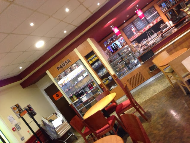
I then when to visit the pausa caffe, which is a small cafe in dunelm. This cafe had a similar theme colour to costa coffe, exept it is a little brighter, this gives it a little more of a upbeat feeling, but relaxing at the same time, as if after you have done yor shopping you can have a rest in the cafe. I like how their menus are black background with red and white type because it makes the type stand out and easy to read from further away. I like how they have a small banner on the door to advatise the cafe, something like this would be nice on the doors of the refectory. They have a vinyl sticker on the door to advertise it as you walk in. Also their menus look like they are also on foamex.
This is a subway in a garage, it looks pretty much the same as it would in its own shop. They have a large sign outside that is lit up, so it is well seen at night. I like the menu becuase it has different kind of poster on it advatising the flavours. Also they have a step by step menu, which shows you the options you can have and in what order. This would be a nice for the refectory, to have a clear Menu and prices.
This is asda cafe, the colours are very similar to costa and the cafe in dunelm, this shows that the colour is popular in cafés, and gives a warm friendly feeling. This cafe has a really small Menu board that you can't really see it that well, also the feeling you get in there is that it is small and uncomfortable, this may be because the furniture is very hard and the other colour is wood which doesn't look as nice as other colours.
I also visited mc Donald's which is a bigger company with restaurants all over the country. Inside there it has a very later back friendly armoshohere with music playing in the background. They have switched to a green theme, which is running throughout all their restaurant, the seating, packaging and even the building. Their menu boards at the top only show what offers they do, and what they are selling currently, there is a Perspex menu with all the food and drinks that they sell. This might be a good idea for the cafe, to have offer menus as well as a full menu.


No comments:
Post a Comment