This is my experimentation after looking at Billie Jean. I wanted to create a sketch illustration like his, but with my own objects found in the classroom. Then seeing Keith Harring's work I though it would be nice to add his people in the background of the illustration.
This is my illustration scanned in a live traced on illustrator.
I reversed the black and white And started to colour some blocks and outlines.
I then added scribbles to objects by using a graphics tablet.
This is my final outcome. I think it reflects the 80's well because of the colours and some of the design. If I would do it again I would add the people on in a separate layer. I think I might use Keith Harring's idea of the people fitting into each other in the background.
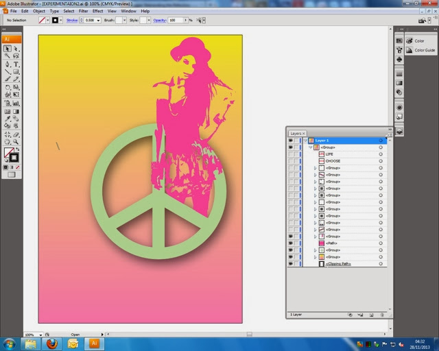
This is the gradient background I did. I chose these colours because I thought it would reflect the 80's better.
I then made a peace sign like the illustration I was going to copy. But I made it a green that would compliment the background.
I then added a silhouette like jasper goodalls illustrations. I made it got pink to it fitted in with the theme and stood out.
I saw that jasper adds some random shaped to his work, so I decided to add 80's themed objects to the illustration.
Being inspired by kathering hamnet I added type over the top. So it sends a message and it's still 80's.
This is what my final outcome is. I think this went well because it looks like and 80's illustration and it's very neat. I enjoyed doing this.


No comments:
Post a Comment