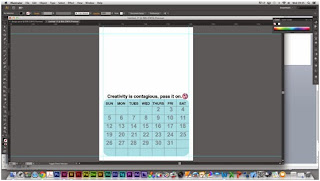
This is how i made my calendar. i created it in illustrator to then place into indesign because i am not very skilled in indesign yet.
i opened up a document a4 size, because this is the planned size for my calendar. i then add rulers to at as margins around my page. this is so it has even space around it and doesn't look squashed or is printed off the page.
i created a box with rounded corners. i did this just to make it more interesting that a normal box.
i then added some vertical lines in the grid, measuring the distance between them.
i then added horizontal lines to make it into a grid with enough squares to fit my dates in.i then roughly added in the days of the week, with the font helvetica, i thought it would be good to keep it helvetia because it is in the CBC branding guidelines, also it is a easy to read bold simple typeface.
although i though helvetica would be the best typeface, i did experiment with others. this is the typeface chalkboard, i only changed three days so i could compare typefaces. i don't like this, i think it is a bit too childish for a college calendar.
next i tried the typeface impact. i think this is to bold and the kerning is to tight for the box it meant to go in, and if i changed to kerning it would look strange.
for this one i used a typeface from the helvetiva family, it is a lighter typeface. i didn't think it stood out enough, and the bolder typeface fits better in the grid.
i decided to add the numbers in the boxes, i placed them in the centre close to the top, so that i could fit national holiday dates in at the bottom, also so there is room to write in the box.
i decided to change the opactity so that you can write over the dates, so that there is more room to write notes it. i did this because there wasn't much room to write personal dates in and all calendars have the space to do that. but instead of just making the numbers smaller i wanted it to be different to average calendars.
i then decided to add the CBC slogan on the calendar, just above the grid, with the logo at the ends. i first typed it in a light helvetica typeface, which i thought made it look nice, but it might not stand out enough.
i then changed the font to a bolder helvetica typeface, but i think it stands out too much.
keeping the helvetica typeface i tried an a italic typeface of the family. however i think the lightest typeface that i chose first looks the best, because it doesn't stand out too much but you can still read it. also it is staying in the same typeface family.
here i decided to move the logo in towards the slogan a bit more so it doesn't look as much out of place.
all Ive don here is imply place in my first edited photo.
i typed out the first month and thought about putting it in the month in the left bottom corner, while i messed around with type. the typeface used here is just Helvetia bold, i thought about sticking with helvetica because it is the only typeface i used, and to keep it flowing.
here i changed it to a lighter typeface, however i dont think this stands out enough because the picture is quite dark.
i then tried it in italic, which i think looks nice and it does stand out, but i dont think it has the same effect as the simple bold typeface.
i decided that it didnt look right where it was, so i decided to move it to the top an saw that it worked a lot better there.
so i measured to make it fit nicely in the corner, with even space.
then i just added UK holidays on the calendar, in a small light helvetica typeface.


No comments:
Post a Comment